Showing posts with label Calligraphic layout and design. Show all posts

Sunday, November 13, 2011

Illuminating The Word: The St. Johns Bible Exhibit, Santa Fe, NM

The weekend of November 5th I was scheduled to go to the New Mexico History Museum to do some demonstrating for the exhibit of the St. John's Bible. Well, true to New Mexico style, a road worker decided to dig up a main power line causing a blackout at the museum and the demos were cancelled that day. Fortunately, the lecture and presentation the following Monday were not.
The St. John's Bible was an idea that germinated in 1995 as Donald Jackson, England's preeminent calligrapher to the Queen, proposed the project to the St. John's College board of trustees. After signing a contract in 1998, artwork on the 15 year, $12 million project was begun. Reaching it's culmination in 2011 with the final book of Revelation, this multi-volume hand lettered and illuminated work of art is magnificent to behold.
The St. John's Abbey in Collegeville MN is founded on Benedictine principles. They assembled a multi-faith team consisting of "artists, medievalists, theologians, biblical scholars and art historians¹" to provide background and direction to Jackson and his team for each illumination, though the artistic execution rested ultimately on the shoulders of Jackson and his chosen artist-illuminators.
The bible itself was constructed using both ancient and modern techniques; the huge folios are written on calfskin vellum using goose and swan quills and 19th century Chinese stick ink. Text layout and some design were done utilizing computers to make sure that each scribe knew where the text was supposed to end on each page, since these were all written in loose folios.


With a goal of making the work a relevant one for the reader of today, the illuminations (illustrations of text) incorporate contemporary imagery and bold graphic quality that are executed with astonishing skill and confidence. These artworks are even more impressive when it is considered that they were done after the pages of text were written, leaving no margin for error.
Suzanne Moore (American) Sirach Folio
Donald Jackson came to Santa Fe's Lensic theater to speak about the project and the associated exhibit. In his hour long talk he spoke of the process of the written page, having four main scribes learn a common script that was developed to allow ease in modern readability and yet impart an sense of the sacred to the text itself. "Calligraphy is something that visually gives words importance" he said in his lecture, and Jackson certainly seems to have a sense of this project and it's place in history. He spoke of the communication that happens between the artist and an artwork as he tried to apprehend the text to be illustrated, and bring the artwork into contemporary understanding. An example is the "Revelation" folio below, where the valley of dry bones shows not only bones, but human industrial detritus as well such as one might see in a junkyard.
Donald Jackson (English) Revelation Folio - Dry Bones (click to enlarge)

Jackson and his artists used recurring, modern themes as imagery throughout the work, such as the textured DNA framework in a gold leafed pattern that pervades the genealogy page of the Gospel of Matthew from background to foreground in layers of artwork with depth and complexity throughout the stylized menorah.
Donald Jackson (English) - Gospel of Matthew Folio (click to enlarge)
The exhibit itself at NMHM is one of the best I could conceive of, with curator Tom Leach taking a personal interest in having brought the bible to the museum after a 6 year negotiation. The current exhibition is titled 'The St. John's Bible and The Contemplative Landscape", and is exhibited in the round with a circular configuration of interior walls. The bible is displayed along with an exhibit of photography of a contemplative nature that compliments the spirit of both bodies of work. Cases were constructed to exhibit the Bible folios that allow a viewer to get very close to view details of the works.
(click to enlarge)


The use of gold, according to Jackson, catches a viewer's attention, and gives a sense of importance to the text. It asks a question and invites exploration into the meaning of it's use. Indeed, as one walks through an exhibit such as this, the eye is continually attracted to the next case as the gold changes in the light the closer one gets to the next artwork.


I was impressed not only with the St. Johns Bible artwork, but the conceptual quality of the thought behind the work. Commentary is made through imagery of our world today and also into the consciousness of the preservation of the planet. The folio below of armageddon shows not only the horrors of war but also some of the roots of war and the degradation of our atmosphere and environment, combining biblical plagues with images of oil wells and modern tanks.
(click to enlarge)
It is not often that I long to return to an exhibit to study imagery more, but this is one that I will return to again.
Many Artists and Calligraphers were a part of this project, including Americans Thomas Ingmire, Diane Von Arx, and Suzanne Moore. Friend Izzy Pludwinski of Israel was also involved in the titling of the books of the Tanach.

Friday, July 8, 2011

Writing without guidelines


Guidelines are important. For a calligrapher, they allow uniformity, consistency and rhythm while allowing one to concentrate on a variety of other things including the refinement of a particular letterform. In developing skill in writing letters, they are indispensable for learning the techniques needed to become a successful calligrapher. They provide a framework for the structure of the proper, historical letterform.

There is a certain point though, where it is a good idea to abandon the guideline and begin to write freely, not to discard proportion and spacing principles, nor even historical letterform, but to pay attention to what your individual hand is doing with the pen, and also to find a comfort zone in the height and proportion of your letters.


There is a freedom in practice that allows for experimentation and exploration. In practice, rather than trying for a finished product,  I am more concerned with paying attention to new things that may be happening that I can later incorporate into my artwork. Just sitting down and writing for a continuous period of time also has the effect of re-establishing rhythm that may have been lost due to being away from the drawing table... it can become meditative and pleasurable.


In the examples here I have begun to write a new poem for which I am trying to get a visual feel . For lack of a direction I picked up a pen with a broad edged metal nib and began writing a semi-formal Roman letterform on a scrap of canvas I had in the studio. This more historical form will not necessarily be what I use for the finished product, it was just what began to come from my hand that day...you can see in the first four lines of the example below I am changing size, weight and style to find out what I like. There is no time wasted here because these experiments will prove useful in future work, and there was a certain point where that "rhythm" kicked in and the letters began to become pleasing. Also this work will provide some good texture for background effect as I move farther on this canvas...


Canvas has a number of benefits for me, not the least of which is that it forces me to slow down significantly in lettering. Drawing a metal pen over unprimed or raw canvas causes the canvas itself to move, and the inks tend to sit up and not necessarily soak in. In slowing down my movements, I then concentrate more of the form of the letter, at the same time allowing my hand to make a natural movement based on the width of the pen nib I selected.


In this type of practice, I am consciously writing letters that I know will eventually be covered over by layers of paint and other lettering... so inside the rhythm I am developing I can work with sizing letters and adjusting on the fly; note for example the last word ("been"), second line from the bottom has two different sized "e"'s and throughout the piece the lettering gets a little larger here and a bit smaller there. What this has done is given me some clues into what my hand tends to "like" in this letter, and I can now pick out the right sized letters and make them "my" height instead of relying on an exemplar's recommendation.


The poem I am writing is a part of my "Baron Journals" project in collaboration with poet Christopher Baron.

Sunday, July 18, 2010

Journal Series: Exploring letterforms, innovation, contrast and page composition

A number of years ago, I decided to take a second class from master calligrapher and artist Thomas Ingmire*. I can count the number of instructors I have taken more than once on, well, two fingers. Thomas' description of what he wanted to do with this course intrigued me because it involved innovation in letterforms, and quite a bit of leeway.

The jumping off point for the week long workshop involved studying an ancient (3rd cent.) letterform called Roman Cursive, which to most modern readers is illegible.  The samples below were taken from Nicolette Gray's work from 1971, "Lettering As Drawing".


I decided to work this week in one of my journals, and began to write the adaptations of the letterforms in a water-based walnut ink... an ink that provides a rich and beautiful walnut hue but one that will also stain the page and leave a "ghost image" if I decided to wash it off.


As calligraphers, we are taught to line out pages and write letterforms within the lines and boxes of text. Working with abstract calligraphy, however, allows one to break from these basic rules. My goal in these pages was not only to develop a letterform from the basis of the ancient Roman cursive, but also to begin to create textures and layering within the continuous page-to-page format of a book.

The double page spread below shows my original practice underneath layers of paint and watery washes, and then written over again with new text.


Taken even further, the concept now has an added element of the bold black letterforms, written in the space normally reserved for text in a book, but written abstractly and fairly illegibly (I say 'fairly' because these are actually written words). This particular page spread now has these text blocks written over about 5 layers of paint, washes and text.


In a continuation of the theme, the layers are present, the text blocks are echoed, but now with a different tool and a textural variation contrasting from light weight lettering to bolder and heavy lettering. You can see I can't stay "in the box" very long, and have to break out on the right folio in preparation for the next page spread...


Coming into the next page spread, all boundaries are forgotten and now we are simply exploring the texture of the text and a sense of depth on the page, all the while continuing to develop that Roman Cursive personal variation..


A couple of folios later, I begin to explore the letters with a larger tool (hand carved black bamboo). In addition, I want to just begin writing without worrying if it all fits onto one page... in this case three double page spreads were utilized.


Though I was writing a variety of texts during this process, the main text that became my theme was the quote from Emerson: "None of us will ever accomplish anything excellent or commanding except when he listens to this whisper which is heard by him alone".


With yet another tool, a brass folded pen called the "moth pen" made by Jim Chin from Chicago, I began exploring more variations, using the same text, and variations of texture over the next three pages. Below is full strength Sumi ink.


The same text as above is written with the same tool, but I have now used a diluted walnut ink and made that my background. I have then taken a randomly carved reed pen and used the Sumi to write a vertical text block in my own modified Roman Cursive.


An finally, I liked writing those vertical columns, and so decided to use them as an exploration of size, weight, transparency and value in the final of the page spreads.


These journals have continued to provide me with a format for experimentation and freedom. Many times I will go back and work on pages that I began months, or even years ago. 
Abstraction provides an even greater freedom to simply react to what is happening on the page before you and to work with your own sense of space and texture.


*More information on modern calligraphy can be found in Thomas Ingmire's book, Codici 1, which can be explored or ordered here.


Sunday, December 13, 2009

Journal Series: A Paradigm Shift from Michael Clark

I am not a guy who walks by and lingers at the card section... I am usually only walking by to get to some other section of the grocery store. One such day I was stopped in my tracks by a card that just happened to catch my eye... the lettering just jumped out at me and I reached out and grabbed the card. When I went to purchase it, the cashier asked me if I wanted an envelope... "nah, this'll do" I replied.


I didn't buy the card to send, but to keep. I was intrigued by the elegance of the letterforms, but also something more specific, the way this artist had used the form of, and had "crossed" the letters "a" and "e" (not normal in this style of letterform). I was also attracted by the texture of the letters themselves, this effect being fomed by the smaller freeform cursive writing being layered across the larger "textura"* style letters. (These elements were to become a springboard or influence for me to develop my own writing style in this hand).


A couple of years later, in Orange County, CA, there was a workshop being offered by a man named Michael Clark. I didn't, at the time, know Michael or his work, but had been recommended to take a class from him from a couple of friends.

Micheal Clark, in short, blew away my preconcieved notions of what "Calligraphy" should be, or rather, how it "should" be done.

As a beginning student, there are so many elements of making letters to learn; "calligraphy" is traditionally thought of as letters made with a broad edged pen, allowing the artist to make thick and thin strokes due to the angle at which the pen is held. These strokes are usually made in a consistent fashion and put together in such a way as to form letters.

Michael didn't worry about this. Pen angles and the order of strokes seemed to go right out the window. He used a tool called the ruling pen to great effect, and didn't care how he got to the letterform, he only cared about the end result. His demonstration was to write a word with a simple stroke... a skeleton of the letters if you will. He then used that ruling pen to add weight and build up the letter where he wanted to. In general, the thicks and thins followed where they would normally be with the making of a letter in a single stroke, but not always! He was drawing... or DOODLING... the letters!

This one demonstration, this man's attitude and his freedom in the love of making letters, was a revelation to me. This first morning of the first day of a two day workshop caused a pardigm shift in my thinking about, and the making of, letterforms.

We took a break, and I was looking thru some of the samples that Michael had brought to show the different letterforms he had created in his career. I purchased his book, and as I flipped thru, there was my HALLELUJAH! This was the guy who had done the lettering to develop that font!

I came to find out that Michael is no rookie in the field of letters... he has won numerous very prestigious type design awards and is extremely well known throughout the lettering and type communities. Some samples of his font designs are below:
(In the selection below of Michael's award winning fonts, you can see that particular letterform on the bottom, called "Sting")


An immediate result of this weekend was a direct application of the built-up-ruling-pen lettering I had learned onto one of my large format paintings called "To Know His Thoughts".

Randall M. Hasson - "To Know His Thoughts" - (detail) 2002 48" X 60" Acrylic on Canvas

What is the end result of having spent a few short hours with the right kind of teacher at the right time? One word... FREEDOM. This paradigm shift allowed me to think like the person I really am, a painter. This line of thought led me to pick up a broad edged pen and begin, with quick and varied strokes, "sketch" letterforms... a technique I still employ today.

One day, a couple of years before my dad passed away, he was in the hospital and my brother and I drove out to visit him. I happened to have my journal with me, and as we sat in the courtyard at a cafeteria table, I took that broad edged pen and made some spontaneous sketched letters in my journal... shown below:


This text and the feel was the direct result of a dim recollection of another layout that I had seen years ago (I believe it was in the Speedball textbook?)... also (I know now) done by Michael. As I look at his more skillful and refined version (below), I marvel at his eye and his sense of space and design.


I have had many wonderful teachers throughout my Calligraphic journey, each contributing in his or her own way to my art... Michael Clark is one of those rare teachers who holds nothing back and is generous with his time and his articulation of his art. He is one who doesn't care so much about following rules, but the end result of seeing a student "make the letterform his own". For this I am grateful.

Michael, for a time, took quite a sabbatical from teaching to raise his family. I believe he is available to teach a little more readily now. For intermediate and advanced lettering artists, I would highly reccommend him for your course of study!


Notes: all images above used by permission.

Michael is the author of a new book: "Letters: The Hows and Whys of What We Do & How I Do It". This is Michael's fourth book. (His first three are sold out.) It can be found here: http://www.johnnealbooks.com/prod_detail_list/30

For more information on Michael Clark and his work, or to contact him about availibility to come treach for your guild, please visit his website: http://www.typerror.com/current6/index.html

Note:
*The "Textura" letterform goes by a few different names, the most easily recognizable being "Old English" or "gothic", also "blackletter". Both the terms "textura" and "balckletter" refer to the appearance of the density of the text in a page of writing.


Friday, November 13, 2009

Journal Series: C.S. Lewis thoughts

One of the things I have come to love about the journaling process is the visual form of thinking that it takes. And yet it is not necessarily "refined" thinking, but rather an artistically articulated version of brainstorming.
My friend, poet and artist/calligrapher Laurie Doctor, wrote a poem called "This Work" that describes this process:
This Work *
My friend, the poet,
asked me
what I was doing.
I said, you know,
the visual form
of mumbling, the verbal
version of stumbling.
Leaving my hands
to their own devices,
closing my eyes,
transforming vices
into color and verse.
Saying this work is my prayer.


-Laurie Doctor

During the period in which I was involved in the C.S. Lewis painting, I was working with the quotes and text that I was considering for the final canvas. The pages below reflect some of that "thinking process.
(Click on the images below to enlarge)
I love Lewis for his profound thinking and verbal imagery... in the middle of the first page spread above, kind of hard to read, is the statement that "the world is crowded with Him"... of course I couldn't have that statement be standing on it's own without "crowding" it a bit by writing something across it...


... and the word "awake" really has to reflect having your eyes open, does it not?

As always, some of the text made it onto the painting, some didn't... but the journey to find out what fits is always a rewarding process.

The pages above were written spontaneously with a "Pentel Color Brush" for the gray lettering, and "Pitt marker pens" for the other text on the first page.


A note about Laurie Doctor: Laurie is someone that I would consider a "visual Mystic". Her paintings are infused with a sense of spirituality and discovery. I would highly recommend exploring her work at www.lauriedoctor.com

Saturday, October 3, 2009

Journal Series: Brennan Manning's "The Ragamuffin Gospel" page

There is a time I think, in all of our lives that we go thru a spiritual crisis or questioning phase... whether you have a "faith" or have rejected one (or many).

There comes a point where you think you have "heard it all before" or, more apporpriately, it just doesn't seem "fresh" anymore. At the time I began this journal, I was in that place. My brother came along one day and as we were discussing this, he mentioned that I should read Brennan Manning. I said "who is he?", and he replied that Brennan Manning is an alcoholic-married-catholic-priest who writes about Grace.

Well that kinda hooked me. He had a copy of the "Ragamuffin Gospel" by Manning that I promptly stole.

(Click image to enlarge)

Manning is one of those writers who came along at the right time for me. He is an Irishman who has that lilting cadence and his writing style is as if he is speaking to you not composing a sentence. Here in this period of my life, this was a pivot-point; I was undergoing a paradigm shift spiritually. Through his writings, my view of my personal and loving God changed and gave me something extremely valuable: Freedom in my faith.

We are encouraged spiritually to "live in the Light", while reality dictates that this is a difficult proposition. The page illustrated above highlights a passage from Manning's book about paradoxes...

"I am a bundle of paradoxes. I believe and I doubt, I hope and I get discouraged, I love and I hate, I feel bad about feeling good, I feel guilty about not feeling guilty, I am trusting and suspicious, I am honest and still play games. Aristotle said I am a rational animal, I say I am an angel with an incredible capacity for beer! To live in Grace means to acknowledge my whole life's story, the light side and the dark. In admitting my shadow side, I learn who I am and what God's Grace means. As Thomas Merton said, "A saint is not someone who is good but who experiences God's goodness". "

The page above is a simple visual illustration of the paradoxical concept. The page immediately preceeding this one dealt with the "be transformed by the renewing of your mind" concept. So, on this page spread, I have illustrated the "light" from that previous page and also a shadowy area as well. As a visual paradox, the text is back in the "boxes" that we have just "broken out of" in the three previous page spreads. Also, I didn't want to write these words in "calligraphy', preferring simply to write them... the act of writing words like this causes me to "apprehend" them more than just reading them.

I am not a big seminar goer, but later I was to attend a weekend series to hear Brennan Manning speak. My notes were in written in a journal spontaneously and will be discussed in a later series...

Friday, September 4, 2009

The process of a traditional (?) calligraphic layout


In my previous post: "Calligraphy Gone Wrong", I discussed the mechanics of rhythm (or the lack of it) in the piece I posted below. (You can click on the image above to enlarge)


I had quite a few comments from the lettering artist community, including one from my friend Doug Boyd who asked me "why did you choose italic for this piece". His further comments:
I asked because I have always believed that the choice of lettering style should help to help and support the intent of the message. Something I have tried to apply (not always successful), is the comment on Neugebauer's "mode of operation"...."He analyzed the texts he was to write, got as near as possible to the intention of the author and then made it visible on paper" Diane Hoare says, "calligraphy should help us see what we are reading by making the words beautiful" Sometimes while italic is a good standard that will serve us well in most cases it does not always achieve the above.

When I lived near Doug we would frequently get together and talk about the "theory" of what each of us were doing. I thought this might be a good springboard for a discussion of the development of a piece of lettering art and the design decision process.


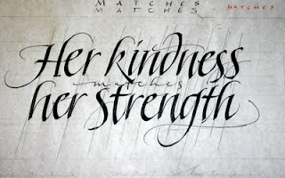
My wife came to me with a quote she wanted to do for a friend. Because she knows the friend well, and has a particular piece of calligraphy that she wanted it to sorta look like, I was forced to work with the "commissioner's" demands. What she really wanted was a simple piece, done in an italic style hand, and with a bit of an illustration to make it "simple and pretty".

Of course, I as the calligrapher know MUCH better than she how to go about the process... don't I?! When I initially received this quote, I immediately sat down to do some rough drafts, detailed in the images below. Here the words "kindness" and "strength" are articulated more along the lines of the Friedrich Neugebauer quote... I am trying to articulate visually the feeling of those two words.


There are a couple of problems with the above layout; one is that the quote says that the kindness "matches" the strength, and in the above layout the two words certainly don't "match". Second is that the woman that this piece is intended for usually has her "strength" emphasized before her kindness and we wanted to de-emphasize that.

I took a look at vertical layouts, which frankly I really liked because it made the words a bit harder to read and made all the letters (in my versions) about the same size. I figured that if the woman was going to hang it on her wall maybe it would be better more calligraphically designed... maybe she wouldn't necessarily want some visitor to read this (easily) about her... so maybe a little harder to read for someone who is a humble individual when it comes to personal accollades...


Of course the "commissioner" (who had a simple and pretty layout in mind to begin with) wasn't going for those.

I then picked up different tools and began to just letter to see what may work for me on this piece...

Pointed brush


parallel pens


In the end I had my pile of trials. The process in this particular case is summed up by a well-known quote of T.S. Eliot:
We shall not cease from exploration, and the end of all our exploring will be to arrive where we started and know the place for the first time.


So... going back to my earlier version, I decided just to clean up the lines a bit, unify the lettering and go with the commissioner's wishes.


The above was done with walnut ink on Zerkal's paper, called here in the U.S. "Niddigan".

One other thing about this lady (for whom the piece is intended) is that her husband is a Master Gardner, and he had, from the plants he works with, developed a particular Poppy that he named after her. I was informed of this of course about halfway through the process of layout and design... so another reason for a simple and straightforward treatment... the lettering cannot be too busy for the illustration I am now going to include...


This illustration is done in colored pencil. Now all that is left is to add the word "matches" and a small credit line...


Tuesday, August 18, 2009

When calligraphy goes wrong... analyzing your own work and going back to the basics

I am a visual artist who uses a significant amount of calligraphy in my work. Most of the work I do is on canvas; where calligraphy is involved, I use acrylic paints and inks, and where no calligraphy is involved, I paint in oils.

Below is a discussion of a project that took me back to Calligraphy on paper, and the resulting analysis of what can "go wrong". Ultimately analyzing your own work is the key to success in any venue...


I am doing a small text for a particular client, and have rendered the quote many different ways in both vertical and horizontal layouts. While I have decided on a simple format, horizontal layout, to which will later have rendering or image added to it, the above image is an example of an unsuccessful rendering of a quote. Forget layout and design for right now, these letters just simply do not go together! While some may individually be nice, the structure is all over the place.

Let's find out why:


Below is the rough draft for this layout. I have drawn pencil lines directly over each letter's stem stroke or axis in some cases. Though not perfect, there is a coordination with each letter's slant in relation to the other.
(You will note that most of my stem strokes contain a natural curve, but these lines are drawn on the bulk of the stroke, which is straight. Also note, the slanted lines were drawn after, not prior to the writing, in an affort to analyze structure.)


I begin to write, taking note of my draft, but immediately I am enamored of the paper! Ah... I remember now! Those rough edges on the side away from where I press my pen to paper, how the laid-lines react with the simple water based inks... the tactile feel of the broad edged pen gliding across a paper surface MADE for writing rather than artists canvas or really rough paper covered with acrylic! Or the butcher paper I usually use for rough drafts! What a joy!


So excited am I that I forget to adjust the paper to my writing posture on the second line, but no matter! So the first stroke is just a tiny bit off, I keep going! As I get to the end of the words I am still so happy...


Many artists, myself included, get to a point where you cannot "see" anymore. What this means I think is that you know maybe something is wrong, but are so into the "details" that you can't see "the forest for the trees". Usually looking at something a day later with fresh eyes will show you what was naggaing at the back of your mind. While the two detail examples above are "sorta" together when taken in detail, and even perhaps nice letterforms in and of themselves, when we look at the whole picture with the same analysis we see total chaos and the whole simple two lines of lettering has fallen apart because of a loss of focus!


If I apply the same type of analysis to my first draft, you can see the lines go all over the place, there is no rhythm and structure even compared to my rough on butcher paper! The stem strokes of the initial "H" don't really line up. What the heck happened to my "d" in kindness, and how can it not completely fall over?! Why am I all of a sudden leaving the "h" in "her" and the "n" in "strength" on the second line so open at the bottom that they destroy any possibility of rhythm? And I think my "g" in strength" wanted to make the "d" of the first line feel better by slanting a little too much itself!


Now, however, having made some simple structural analysis, I am ready to pay attention to the structure and move forward with the final drafts of the project.