
Below is a discussion of a project that took me back to Calligraphy on paper, and the resulting analysis of what can "go wrong". Ultimately analyzing your own work is the key to success in any venue...
 I am doing a small text for a particular client, and have rendered the quote many different ways in both vertical and horizontal layouts. While I have decided on a simple format, horizontal layout, to which will later have rendering or image added to it, the above image is an example of an unsuccessful rendering of a quote. Forget layout and design for right now, these letters just simply do not go together! While some may individually be nice, the structure is all over the place.
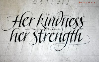
Let's find out why:
Below is the rough draft for this layout. I have drawn pencil lines directly over each letter's stem stroke or axis in some cases. Though not perfect, there is a coordination with each letter's slant in relation to the other.
(You will note that most of my stem strokes contain a natural curve, but these lines are drawn on the bulk of the stroke, which is straight. Also note, the slanted lines were drawn after, not prior to the writing, in an affort to analyze structure.)
I begin to write, taking note of my draft, but immediately I am enamored of the paper! Ah... I remember now! Those rough edges on the side away from where I press my pen to paper, how the laid-lines react with the simple water based inks... the tactile feel of the broad edged pen gliding across a paper surface MADE for writing rather than artists canvas or really rough paper covered with acrylic! Or the butcher paper I usually use for rough drafts! What a joy!

So excited am I that I forget to adjust the paper to my writing posture on the second line, but no matter! So the first stroke is just a tiny bit off, I keep going! As I get to the end of the words I am still so happy...

Many artists, myself included, get to a point where you cannot "see" anymore. What this means I think is that you know maybe something is wrong, but are so into the "details" that you can't see "the forest for the trees". Usually looking at something a day later with fresh eyes will show you what was naggaing at the back of your mind. While the two detail examples above are "sorta" together when taken in detail, and even perhaps nice letterforms in and of themselves, when we look at the whole picture with the same analysis we see total chaos and the whole simple two lines of lettering has fallen apart because of a loss of focus!
If I apply the same type of analysis to my first draft, you can see the lines go all over the place, there is no rhythm and structure even compared to my rough on butcher paper! The stem strokes of the initial "H" don't really line up. What the heck happened to my "d" in kindness, and how can it not completely fall over?! Why am I all of a sudden leaving the "h" in "her" and the "n" in "strength" on the second line so open at the bottom that they destroy any possibility of rhythm? And I think my "g" in strength" wanted to make the "d" of the first line feel better by slanting a little too much itself!

Now, however, having made some simple structural analysis, I am ready to pay attention to the structure and move forward with the final drafts of the project.
No comments:
Post a Comment