Showing posts with label Painting Process. Show all posts

Thursday, February 6, 2014

"The Question Of God"

So, we had a recent "creation vs. science" debate with Bill Nye and Ken Ham.

This is an interesting topic. No, I didn't bother to watch… and really it is beside the point. I wonder, in any style of limited debate like this, if any side has justice done. I mean really, Science, by definition, aspires to what is “provable”. Faith is based on exactly the opposite, though (contrary to popular belief) not in an uninformed manner. Of course what is “provable” will always have the advantage.

©2005 Randall M. Hasson
C.S. Lewis - The Spirit and the Man
(Detail) © 2005 Randall M. Hasson
One of my favorite treatments of this Creation vs Science “debate” was a documentary done by PBS called "The Question Of God" which I studied as I was doing research for a painting on C.S. Lewis. The premise was a Harvard professor of Psychology (Dr. Armand Nicholi) who was teaching a class on Freud. Having just Freud’s view wasn’t working for him, so he added C.S. Lewis for students to compare and contrast. It became so popular that it has been offered for over 35 years. When PBS did the documentary, they had a nicely mixed panel of agnostics, atheists, believers, apologists and professors. It is one of the best treatments I have ever seen. From the PBS Website: “Their arguments can never prove or disprove the existence of God. Their lives, however, offer sharp commentary on the truth, believability, and utility of their views.”

This documentary is really a thoughtful, fascinating journey. Both Freud and Lewis, as well as the panel members, could actually articulate each of their worldviews without propagandist rhetoric (or what it seems that we in social media now practice: “name calling”). I believe, personally, that the more science advances, the more it strengthens my faith, but that is just me.  Yes I understand that there is the epic of Gilgamesh “before Noah” was written, yes I have studied where our earliest forms of writing came from, yes I get that someone just found and put together a round “Noah’s ark” recently, etc, etc. All good. If you think that Faith is Mythology, no problem, but also remember that “mythologies” come from somewhere and point to some actual person or event. Lewis, a literary scholar (and an atheist at the time), came to conclusions about this issue of mythology poignantly with this reference in his biography "Surprised by Joy". 

The point is this: educate yourself, be informed and quit propagating ignorant or partially informed statements (on both sides) that fail to take into account our heritage as Humans walking in this world and how we choose to live our own “one and only” life on this earth. The right of others who don’t “live by our rules” to not be inundated by our conservative or liberal bashing posts on social media should be a given.  (That is why there is a "hide" button on Facebook by the way. Try it, it'll make your life so much better!) Everyone complains about slanted news - Fox vs CNN and so on. We all are entitled to our own opinion. One of the things I keep learning is "the more I study, the less I know". Go research your sources please, and:  
Always be prepared to give an answer to everyone who asks you to give the reason for the hope that you have. But do this with gentleness and respect. (1)

The older I get, the more I am partial to Rilke's statement below:
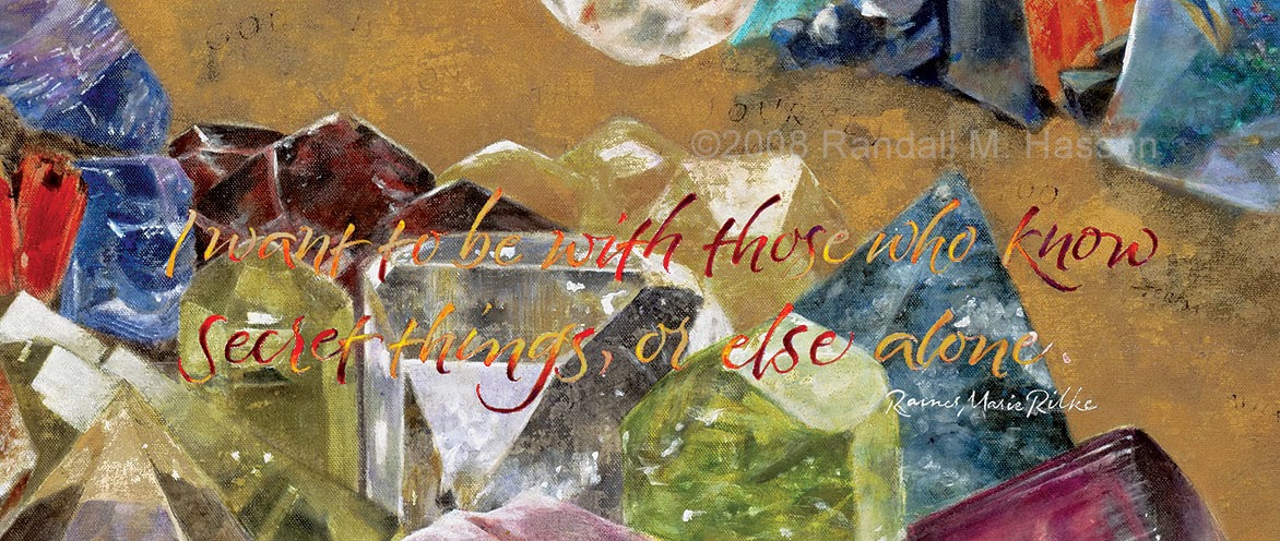
 "Forever" (detail) ©2008 Randall M. Hasson
"Forever" (detail) ©2008 Randall M. Hasson


(1). 1 Peter 3:15

Sunday, April 29, 2012

Commissioned painting: Thoughts on Angels and Light

Over the past couple of months, I have taken on a commissioned painting which takes an Angel as it's subject. This painting is large: just under 9' high and 6' wide.... large enough that I am painting it on-site. During in-depth interviews with the client and a couple of hundred pages of study on the subject, we came up with a direction and I had some imagery formulated in my head.

Angels, according to Judeo-Christian tradition, are messengers and beings of light. The word "angel" itself comes from the Greek and Hebrew words that mean "messenger". Through my studies, I came up with keywords that helped me characterize some visual qualities of Angels: light, fire and movement. In the Bible they have always been portrayed like men, while our visual heritage through centuries of painting shows them with wings. It is interesting to note that up until the forth century, angels weren't shown with wings, and then the first paintings show them with black or dark wings like birds.

For this painting, the client had a specific vision of an angel in action. One of her keywords for the painting was protection... a warrior angel protecting his charges and taking care of God's business. She was looking for the angel in a specific act... the Angel was going in one direction when suddenly it sees someone that needs help... the moment is of a change of direction in mid flight. This Angel was to have white wings.


The painting process is an interesting one, and working closely with a client on-site poses great opportunities for debate, stimulating conversation, brainstorming, and also opportunity for creative conflict.. After a couple of weeks, we had a discussion about the direction I was taking visually. At this point in the painting, what she was looking at and where I was going seemed to be two different emphases. I am attempting to create a painting of a being of light. Her desire is that I capture the intent of that specific moment. I realized that in this instance, she was reacting to what was on the canvas in front of her, while I was painting what I knew it was going to look like in a month. I could see the end result but she wasn't able to see where I was going.

Moments like this are defining moments in a project, and sometimes a career. She asked me to change what I was doing, and I was going to comply... it is her painting after all, on her wall, and she was paying me to create something for her. I was at a point where I was contemplating rolling up the canvas and starting over on a new one... one that I knew would be beautiful but that wouldn't have the magic I originally saw. I would just take this one back to the gallery and finish it there the way I knew it was 'supposed' to be.

I am fortunate to have a client however, that is sensitive and has seen enough of my work to have faith and trust in the process of the painting and the workings of the Spirit. She called me the next day and asked me to continue with my vision... she would trust that the outcome would be born of the Spirit. It was also an  excellent point within the painting process;   she was able to clarify for me that the intent of the figure was the key for her, but she realized that her vision would be different from mine.

Below are images of the progression of this canvas. With respect to the light rays, it is probably somewhere between 30% and 50% done... with the layering techniques I use, I expect the figure to be painted, then light painted through, and the figure again repainted. This has already happened a couple of times, and could occur multiple times as the process continues. The layers and light are important elements, and my goal is that as a viewer moves through the room, the reflective properties of the interference and pearlescent paints I am using will change and move with each step, both from within and without the figure. With the layering, the viewer will literally be looking through the glazes, making for depth in the movement of light as well.


The image that I am painting comes from my belief that if we were to see angels as they really were, spiritual beings, they would be a glittering and glorious sight to us that would leave us in awe, or fear and trembling. Since light is made up of all colors, this piece will have to have an array of color/light as well. Painting a subject like this leaves one to contemplate:  if Angels are said to be the lowest order of God's created beings, then they are merely a dim reflection of the glory of He who is actually "clothed in light".

Quite a thought to try and get one's brain around.


Monday, February 20, 2012

The beginnings of a trial version

Each time I do a painting, I usually have a strip of canvas where I can do trials of lettering. Most of the time with imagery I don't do a "real" comp but rather I just sketch and paint directly. In this case I  have that canvas strip, but I decided that I will do another complete painting that will act as a comp and where I can experiment, a  "small" canvas about half the size of the project. Here I have the 4' X 6' canvas laid on the floor on a tarp and am working out some painting techniques using a 10" drywall blade.


These strokes done in gold, white and  pale sienna will be repeated in layers and glazes over quite a few days with lettering and other imagery in between and there will be color washes throughout. They are abstracted to convey the feeling of movement. Later there will be various shades of gold powders mixed and applied in glazes as well. The final result should have the feelings of movement, fire, power, majesty, etc. The image of the angel will then be painted over this ground.


There is not much to decipher of this wrinkly canvas at this stage.  Because the canvas isn't on a frame or stretcher bars, it will go through various stages of buckling as the paint dries unevenly. It will eventually become flat again as the whole surface is covered. This is all part of the process... I am not looking at what is on the canvas today, I am looking at what will be there in 2 weeks. The most important aspect now is to establish that feeling of movement and power.

Saturday, February 18, 2012

Beginnings

I get pretty excited when I embark on a new painting. There is something wonderful and compelling about a blank, unprimed and unstretched canvas which cries out to an artist of it's need for the creative process to begin. I can feel it when I am there: there is an anticipation of that first mark, that first brushstroke, that beginning.

The new project is substantial, and I have a sense that it will be important.


The subject will be challenging and rewarding if I can manage to capture the feeling and convey it into the space... to allow the people who inhabit the space to get the sense of a presence there, or to be reminded of the unseen.


An interesting subject, Angels. Something I hadn't taken a large amount of time to study. They speak of protection and assurance that the message they carry is true. 

The image above was something that came fairly quickly... or as quickly as large letters can come while dipping a black bamboo carved pen into ink and attempting to lay down letters on raw canvas. One of my favorite times in a painting is this exploratory stage, trying things out on practice canvas to see how it translates. The table below the painting is ancient by today's standards... there is speculation that it may have been in the Notre Dame Cathedral at one time. I know not if this is true, but this image of the cross comes from the center. Like those who take rubbings of inscriptions, I laid the canvas down on the carved-relief cross and made a rough sketch. 

Beginnings are always interesting... the start of a new journey. I am looking forward to what is around the bend.

Friday, September 23, 2011

Film Review: Transformation and redemption in "Wasteland"


It is difficult to watch people in difficult circumstances. More than a dramtization of events, a documentary introduces you to the actual participants and allows a gut level reaction, and an identification that allows empathy as you hear the story.
Wasteland was a difficult film for me to watch. I didn’t like seeing the dirt and the filth in which people were forced to work. Yet I had respect for the reasons some were there: honest work, to stay off the streets, to simply try to earn a living vs. stealing. Vik Muniz’ vision of giving back to this sector of his community is a grand gesture to bring to light a hidden society. What he didn’t count on was that he would become involved and care about the lives of his participants.
Muniz’ original idea was to do a project that would benefit the hidden society of Jardim Gramacho in Rio de Janiero. This site is the largest landfill in the world, and is a virtual island of garbage  where the catadores, or garbage pickers, earn their living. Many of the workers originated from lower middle class circumstances, as did the artist himself. Muniz decided to use his photography and alternative-materials art concepts to create works that would be sold and the resulting profits donated back to this community.
His concept was to find models for the imagery, create scenes to photograph for use as artwork, and then use the garbage to form works of art. The process involved projecting a photographic image on the floor of his studio and having the workers and models themselves place the garbage in the light and shadow areas as he directed from a high platform above. Areas that needed shading would be tended to by Vik with dirt and a sifter. When the image was complete, he would then photograph it.
Some very interesting things happened. At a certain point of working with the catadores, a couple of them declared that they never wanted to go back to work at the land fill. A scene of a discussion between Vik and his wife and partner centered around having the workers in the studio. Were they giving them too much hope? Was it better to just let them stay in their own circumstances and not wish for things they couldn’t have. Was it cruel? It was an interesting process to watch, and a brilliant addition to the film because it is the age old controversy… who are we as individuals to decide what information others should or should not have? In the conversation Vik makes the assertion that hope is a good thing for anyone and could be a motivating factor in a transformation for some in the community.
As the project is finished, Muniz chooses a piece (based on “The Death of Marat” by David) to take to London for auction which features Tiao, a worker who has formed an association on behalf of the catadores. He takes Tiao to London to witness the auction at which the artwork sells for 39,000 pounds. It is an astonishing experience and a broadening of worldview that would affect Tiao for the rest of his life, in addition to the proceeds that would help with his community.
Back in Brazil, Muniz has an opening at the Rio de Janiero Museum of Modern Art for all the work he completed, and the workers can now come and see the whole body of work in which they were involved. The monetary result of this show is that over $250,000 is raised on their behalf.


In the end, the transformational process was distinct. Some of the workers declared that they could never go back, and some returned to their life, richer for the experience, and some, like Tiao, used the tools they had gained to expand help for the community. Especially poignant were some final scenes where the artist brought these museum quality pieces of art and presented each participant with a portrait of themselves to hang on the walls of their humble living circumstances. It was a fitting ending, and the contrast of setting was as impactful as the process of transforming garbage into beautiful works of art.
This film illustrates what is truly important about a successful work of art: the ability to deeply touch the emotion and wonder of the people it comes into contact with.

Friday, May 6, 2011

The Baron Journals

I am privileged to be working on a project that involves the fusion of artwork, calligraphy and poetry. 


My friend Chris Baron is a poet. His body of work includes writings about Romanian roots and his identity being raised in a Jewish home in Brooklyn, writings around his impressions of a trip he took to Israel and Palestine, and writings that concern history including the holocaust.


I will attempting to interpret selections from a series of his poetry, and in the process working with programs like Adobe inDesign in order to create a more finished presentation and also to explore the fusion of digital images with the artwork in order to enhance the effects. I have worked on this project for a class, and will continue to work with Chris over the next six months or so to add poetry and artwork. I am using the large watercolor journals I love to work in, with artwork in mixed media including acrylic paint, ink, graphite and colored pencil. Below is our first prototype that includes the initial poem I have selected to begin the volume.


Chris' "Life Unworthy for Living”, seemed to be the text to begin this journey. The concept of the smooth stone emerges in this selection, and I have begun to attempt to explore the significance of stones; they correlate closely to Chris’ poetry as symbols of reverie, remembrance and memorial. This symbol will carry through the volume to tie pages, poems and themes together.


In this volume, I asked Chris to write an intro to his first poem; because the text in the book will be harder to read at the size of the preview, I have included the intro below, as well as the poem. Be sure to click on the full screen icon in the bar below the book to view at the larger size. 


I hope it speaks to you, and I will look forward to posting updates as new poems are completed and included over the coming months. - RH


In a Brooklyn apartment on Ave P and Quentin, a seven year old boy, after a long and guttural Hebrew prayer, is sent to play in his Grandparent’s bedroom. He waits at the door and listens. In the stillness, the sounds of words wrapped in tears turn to a slow hum and a desperate pleading. They are watching a film about the Holocaust. They are remembering. His young eyes are not allowed to see them, but the sound overwhelms him. Soon enough, he would see it, and the images would break him. They are mothers and fathers. They are children like me. Trains, and dust, and smoky starlight. After, his father walks in, holds the boy in his arms, and he whispers, “Never forget.” He never did, and the truth of his heritage became real.


Life Unworthy Of Living
- “lebensunwertes Leben” -
©2007 Christopher Baron

I am quiet
in my own history.

I walk a smooth stone
between my fingers
along my hand
in utter silence
writing poems
about the Holocaust.

It’s been six decades
I wasn’t even there, yet
my mind won’t let me believe
what my heart is living through.
The memories rise
in the voice of my grandfather,
so I go there again, and this time,
as children. This time
not alone.

I’m on my knees holding you.
You are looking into me.
It is cold,
but we are outside,
and our coats are torn.
There is a man in a dark hat,
his eyes are made of wood,
his hands are clothes pins.
He is hanging us on his line one by one
Tells us that we are...
“life unworthy for living”.
I pull you close to me,
whisper in your ear
at that same moment
not to be afraid.
“G-d will look after you.”
But in this deep place
of utter silence
I can only hear
the scrape of the train
coming in,
over the voice
of the clothes-pin man,
the iron wheels grinding,
and the shreiks of the train whistle
so loud that it is utterly silent.
Yet even in a memory
which is not my own
I follow the steam up and up
where it circles against a dark sky
and for a moment breaks the clouds
where starlight pours
into stillness,
a silence that veils
a people, visible, invisible,
who have always lived
who will always breathe
in the still
and sovereign
glory of life
worth living.


this time, not alone... by Christopher Baron, Randall M. Hasson | Make Your Own Book

Many thanks to Alice Hancock and Michael Clark for taking the time to give me much needed feedback and input on the layout process!

Sunday, July 18, 2010

Journal Series: Exploring letterforms, innovation, contrast and page composition

A number of years ago, I decided to take a second class from master calligrapher and artist Thomas Ingmire*. I can count the number of instructors I have taken more than once on, well, two fingers. Thomas' description of what he wanted to do with this course intrigued me because it involved innovation in letterforms, and quite a bit of leeway.

The jumping off point for the week long workshop involved studying an ancient (3rd cent.) letterform called Roman Cursive, which to most modern readers is illegible.  The samples below were taken from Nicolette Gray's work from 1971, "Lettering As Drawing".


I decided to work this week in one of my journals, and began to write the adaptations of the letterforms in a water-based walnut ink... an ink that provides a rich and beautiful walnut hue but one that will also stain the page and leave a "ghost image" if I decided to wash it off.


As calligraphers, we are taught to line out pages and write letterforms within the lines and boxes of text. Working with abstract calligraphy, however, allows one to break from these basic rules. My goal in these pages was not only to develop a letterform from the basis of the ancient Roman cursive, but also to begin to create textures and layering within the continuous page-to-page format of a book.

The double page spread below shows my original practice underneath layers of paint and watery washes, and then written over again with new text.


Taken even further, the concept now has an added element of the bold black letterforms, written in the space normally reserved for text in a book, but written abstractly and fairly illegibly (I say 'fairly' because these are actually written words). This particular page spread now has these text blocks written over about 5 layers of paint, washes and text.


In a continuation of the theme, the layers are present, the text blocks are echoed, but now with a different tool and a textural variation contrasting from light weight lettering to bolder and heavy lettering. You can see I can't stay "in the box" very long, and have to break out on the right folio in preparation for the next page spread...


Coming into the next page spread, all boundaries are forgotten and now we are simply exploring the texture of the text and a sense of depth on the page, all the while continuing to develop that Roman Cursive personal variation..


A couple of folios later, I begin to explore the letters with a larger tool (hand carved black bamboo). In addition, I want to just begin writing without worrying if it all fits onto one page... in this case three double page spreads were utilized.


Though I was writing a variety of texts during this process, the main text that became my theme was the quote from Emerson: "None of us will ever accomplish anything excellent or commanding except when he listens to this whisper which is heard by him alone".


With yet another tool, a brass folded pen called the "moth pen" made by Jim Chin from Chicago, I began exploring more variations, using the same text, and variations of texture over the next three pages. Below is full strength Sumi ink.


The same text as above is written with the same tool, but I have now used a diluted walnut ink and made that my background. I have then taken a randomly carved reed pen and used the Sumi to write a vertical text block in my own modified Roman Cursive.


An finally, I liked writing those vertical columns, and so decided to use them as an exploration of size, weight, transparency and value in the final of the page spreads.


These journals have continued to provide me with a format for experimentation and freedom. Many times I will go back and work on pages that I began months, or even years ago. 
Abstraction provides an even greater freedom to simply react to what is happening on the page before you and to work with your own sense of space and texture.


*More information on modern calligraphy can be found in Thomas Ingmire's book, Codici 1, which can be explored or ordered here.


Saturday, February 20, 2010

The Shema: A journey into the realms of the Spirit

A little over a year ago, a friend asked me to do a painting for him that contained the "Shema", that most ancient Hebrew prayer: "Hear O Israel, the Lord our God, the Lord is One".

This small request was interesting because I do not read Hebrew, and up to this point hadn't written it either. In addition, it gave me the excuse to embark on a course of study that was to take me into the realms and the complexity of the Jewish Faith.

In the resulting paintings, the three parts of the Shema (Deuteronomy 6:4-9, Deuteronomy 11:13-21, and Numbers 15:37-41) are written in separate pages of Hebrew, then the two pages in the middle are translated in English. The main verses are layered over all of it...

(Click on the image to enlarge)

The word "Shema" means "listen" or "hear". One of the first books I read dealt with the meaning of  the "Shema" through the context of the various cultural stages in the long history of the Israelites. One of the most interesting observations of this book was that when Moses addressed the Israelites and asked them if they would accept and practice these tenets and precepts (this way of life), they replied
"We will do and we will hear".(1)
The order of the words is very important here; this form of "hearing" is by the experience of doing; the opposite of our idea in the western culture of "knowing why" before we choose to do something. In our culture we would say "we will hear" and then "we will do". There is an element of faith in the "doing" first and then coming to an understanding later through that process. (1)

I became more and more intrigued with the roots of this ancient prayer: This is the root of our Judeo-Christian culture of faith. I embarked on a three month long course of study which included books and writings about the origins of the Hebrew alphabet, the culture from which it was born, the mysticism associated with each letter, and the spirituality associated with each word which is made up by each of these individually significant letters, and the lessons that can be taken from what we take for granted to be "just words". *

Of course, I couldn't just stop at just one of these paintings. 

My good friend Izzy Pludwinski (2), the wise and accomplished calligrapher from Israel, was extermely patient with me in analyzing and helping me to learn to write the Hebrew text. I ended up doing a series of four paintings. One common visual theme among these paintings was that I wanted the representation of "pages" to have a couple of characteristics: I wanted them to be sort of "floating" (as through the mists of time), and I wanted them to look more ancient. I had a "dead sea scroll"(3) -type look in mind.

One of the series of paintings incorporated the gems which I had studied in a  recent, previous painting called "Forever". For that painting, I had researched many of the physical, metaphysical, mystical and spiritual beliefs centered around  various precious stones.
(Click on the image to enlarge)


In the painting above ("Shema 4"),  the stones in the middle represent the 12 tribes of Israel and are the stones of the breastplate of the High Priest; they also are the same stones represented as the Foundation Stones of the New Jerusalem spoken of in the New Testamant book of Revelation.

I also found that the number 13 is a significant number in Judiasm, being (among other things) the numerical value of the word ahava (love, Alef-He-Bet-He) and of echad (one, as in the Shema, G-d is One!, Alef-Chet-Dalet).  "Echad" is such a key word in the main part of the "Shema" (referring to the oneness of G-d), that placed behind the whole composition, and out of which the whole painting "springs forth", is the larger, crystal clear "13th stone".

In addition, there was room on Shema 4 to add more to the composition, and this was done by exerpting another verse, in background texture: "You shall teach them to your children, speaking of them when you sit in your house, when you walk by the way, when you lie down, and when you rise up"(4). I just happened to like the lyricism and the rhythm of these words that, to me, speak of parenting and direction; a passing on of a sacred tradition.

I find that paintings like this are the most intriguing to me... they are a challenge on a multiplicity of levels. I love to do paintings that contain significant themes, and this one certainly opened new vistas of insight and thought for me.

I look forward to the next journey.

*More information on these paintings, including the books used in reference and larger detail images, can be found at either of these links:
http://www.randallmhasson.com/Sh'ma.htm
http://www.randallmhasson.com/sh_ma_4.htm


(1)  Witnesses to the One: The Spiritual History of the Sh'ma ~ 2006 Rabbi Joseph B. Meszler; Jewish Lights Publishing
(2) Izzy teaches correspondence course in Hebrew Calligraphy, and is a sought after artist. His website is: http://www.impwriter.com/
(3) note: the Dead Sea Scrolls had a more ancient Hebrew style of text; I opted for a more readable version of text for the current viewer of the painting.
(4) Deuteronomy 11:19 (NKJV)

Sunday, January 24, 2010

The announcement of the new C.S. Lewis College, and a story

Some few years ago, I was contacted by a company with which I was not yet familiar.

Being a Californian born and raised, I had never heard of Hobby Lobby. For those of you who don't know (and at the time I looked them up), Hobby Lobby is the 3rd largest arts and crafts chain in the United States (behind Michael's and Joanne's). They have no stores or presence, however, in CA.

Hobby Lobby was founded by an individual named David Green. His mother, Marie Green was a 1920's revival preacher.

Hobby Lobby is a store that supports different charities. One of these charities is called "The Book of Hope", which is a world evangelism organization. When the Book of Hope organization needed a new facility, Hobby Lobby stepped in, purchased a vacant building in Florida, and renovated it to become the new facility for this group. They decided to dedicate the building to Marie Green, David's mother... a fitting dedication for an evangelistic outreach.


I was contacted in 2004 by Hobby Lobby to execute a "Legacy Commission" for the Lobby of the new Book of Hope* facility. the resulting painting, pictured above, is called "The Evangelist".

After this painting, I was contacted by the CS Lewis Foundation, and discussions began about having me do some work for their upcoming conference in Oxford and Cambridge, England. What resulted from this encounter with the Foundation was my very next painting: "C.S. Lewis, the Spirit and the Man".


This painting was completed in 2005, in June, about a month before this conference ("Oxbridge" 2005). When one of the scheduled speakers became ill, I was asked to come to Oxford to make a presentation on my painting. The resulting trip was an eye opening experience for me. The attendees were scholars, university faculty, clergy and other interested parties. I was honored and not a little bit humbled to find that the list of mainstage presenters was varied and famous: among them Chuck Colson, Richard Foster, Dana Gioia (acclaimed poet, and Chairman of the National Endowment for the Arts), and Rick Warren.

Frankly, my ignorance served me well on this trip... I made a 15 minute presentation on the second day I was there, before I really knew who else was coming onstage after me... If I had known I would have been too nervous to even walk up on stage!

To be among the faculty, staff and participants was something I will never forget and look forward to attending again.

The C.S. Lewis foundation began in 1972, and among their many goals, two were to a) purchase, renovate and pay off the home of C.S. Lewis in "The Kilns", Oxford, England. The other was to find a suitable facility to begin the dream of founder J. Stanley Mattson... "The C.S. Lewis College".

I had not seen Stan Mattson for some years. I was pleasantly surprised, when I was in California last September, to be invited to the home of a friend for dinner which he was attending. After dinner, Stan told us he had some exciting news.. that they had a probable benefactor for the C.S. Lewis College, but couldn't reveal any more information until the planning was finalized.

I was speechless about a month later, when the email came announcing the news:
That vision is now about to become a reality as plans move forward to launch C.S. Lewis College on the beautiful campus in Northfield, Massachusetts, recently acquired for this purpose from Northfield Mount Hermon School. This property has been purchased for the use of C.S. Lewis College by Hobby Lobby, a privately held retail chain of arts and crafts stores based in Oklahoma City, OK.

Talk about a small world. I am pleased to announce that the original painting, "C.S. Lewis, The Spirit and the Man", will hang at the new college. I feel blessed to be a part of this whole chain of events...


Notes:

*"The Book of Hope" organization is now called "One Hope"

* After my presentation at "Oxbridge", I was asked by many of the attendees for a copy. I have made that presentation available here.

Saturday, October 17, 2009

Evolution of a Portrait: Holly in Headwrap

(Click on any of the images to enlarge)

After an extensive project which involved Hebrew Lettering (which I do not read), I decided to take a so-called lettering break and do some portraiture in oils. Because I normally paint in acrylics whenever lettering will be involved, this medium is a stimulating and exciting new venture and challenge for me.

One of the artists with whom I am privileged to share the gallery is Marileigh Schulte. Marileigh is a phenomenal painter who came out of the fashion industry. My daughter Holly is one of her favorite models, and Marileigh was kind enough to give me a disk with about 300 photos of Holly in all kinds of different costume. Not only does the camera love Holly, but this woman REALLY knows how to use one! (To give you an idea, when I want to paint a model, I take probably 100 photographs to get about 5 or so that I can paint from… Marileigh gave me 300 photos and I narrowed it down to 100!)


I like the wash effect that I get from acrylics, so I decided to work with the oils in that fashion as well for my background.


The first stage for me is simply light and shadow. Above I have rendered the model with mainly white coupled with a bit of sienna. I like to work pretty thin so that the background shows thru in areas.


Next stage is to begin to add the darks and paint in the necklace. Wanted to get some red on there too as you can see...


I almost never get the face correct with a sketch, and even if I were to get it right, I still must then get the light and shadow correct. Frankly I could TRACE the darn thing and still have as many minute adjustments probably as what I normally have when I paint. In the stage above, structurally, I had to narrow the set of the eyes and also narrow slightly the width of the face. This is always the hardest day (or days) for me... so many minute adjustments, and sometimes it actually take me a couple of days to get it right... sometimes looking at a painting with "fresh eyes" after taking a day or two away helps me to see what is off.


Final stage was to finish the hand (hands can be weird looking!), and add bracelets and finish rendering the necklace and that purse looking thingy that hangs from her neck.

People ask me all the time, how do you know when a painting is done? This particular painting was very interesting because at almost every stage, I had people who came into the gallery telling me that they liked it "just as it is". There was/is something pretty ethereal about this particular piece.

Another strange thing is that I have had, over the past week, at least five people tell me that the painting seems more real to them than the picture. I believe that these reactions are because of compositional focus... my aim was to have the focus directly in the eyes... and having everything else in the real photograph in full focus probably detracts from that. My goal from the beginning was to "fade out" or merge the rest of the figure with the background. Because you cannot get away from "those eyes", I think a viewer is lead into a, perhaps, more intimate or compelling interaction with the painting...


Monday, September 7, 2009

Newly Completed painting: "Holly in the Red Gloves"

"Holly in the Red Gloves" ©2009 Randall M. Hasson


After taking quite a long break (much to the chagrin of my blushing bride) I have finally returned to the easel and completed one of my oil painting series. It is good to be back at the easel again, and happy to have the second painting already in progress!

The model is my daughter Holly Rhoads. Stay tuned for more progress reports on the next portrait... see below!